Introduction: Unlocking the Power of CSS Grid
Welcome to the ultimate guide on CSS Grid, the revolutionary layout system that has transformed how we design websites! Imagine creating complex, responsive web layouts with ease—grids that adapt seamlessly to any screen size, from mobile devices to sprawling desktop dashboards. As of February 2025, CSS Grid enjoys over 97% browser support, making it a cornerstone of modern web development. Whether you’re a beginner looking to ditch outdated methods like floats or an experienced developer aiming to refine your skills, this tutorial will take you from the basics to advanced techniques.
We’ll explore practical examples, answer common questions, and even suggest visuals you can craft in Canva to enhance your learning. Let’s dive into the world of CSS Grid and elevate your web design game!
CSS Grid is a two-dimensional layout system in CSS, meaning it handles both rows and columns simultaneously. Unlike Flexbox (great for one-dimensional layouts) or clunky old-school tables, CSS Grid offers precise control, making it perfect for everything from simple two-column designs to intricate image galleries. Ready to master this game-changer? Let’s get started.
Table of Contents
Why CSS Grid Matters
Before CSS Grid, web layouts relied on hacks like floats, rigid tables, or Flexbox, which excels in linear arrangements but falters with grids. CSS Grid fills this gap by providing a dedicated system for two-dimensional designs. With features like grid-template-columns, auto-fit, and alignment controls, it’s built for flexibility and responsiveness—crucial for today’s multi-device world. Its near-universal browser support ensures your designs reach virtually all users, boosting both usability and SEO.
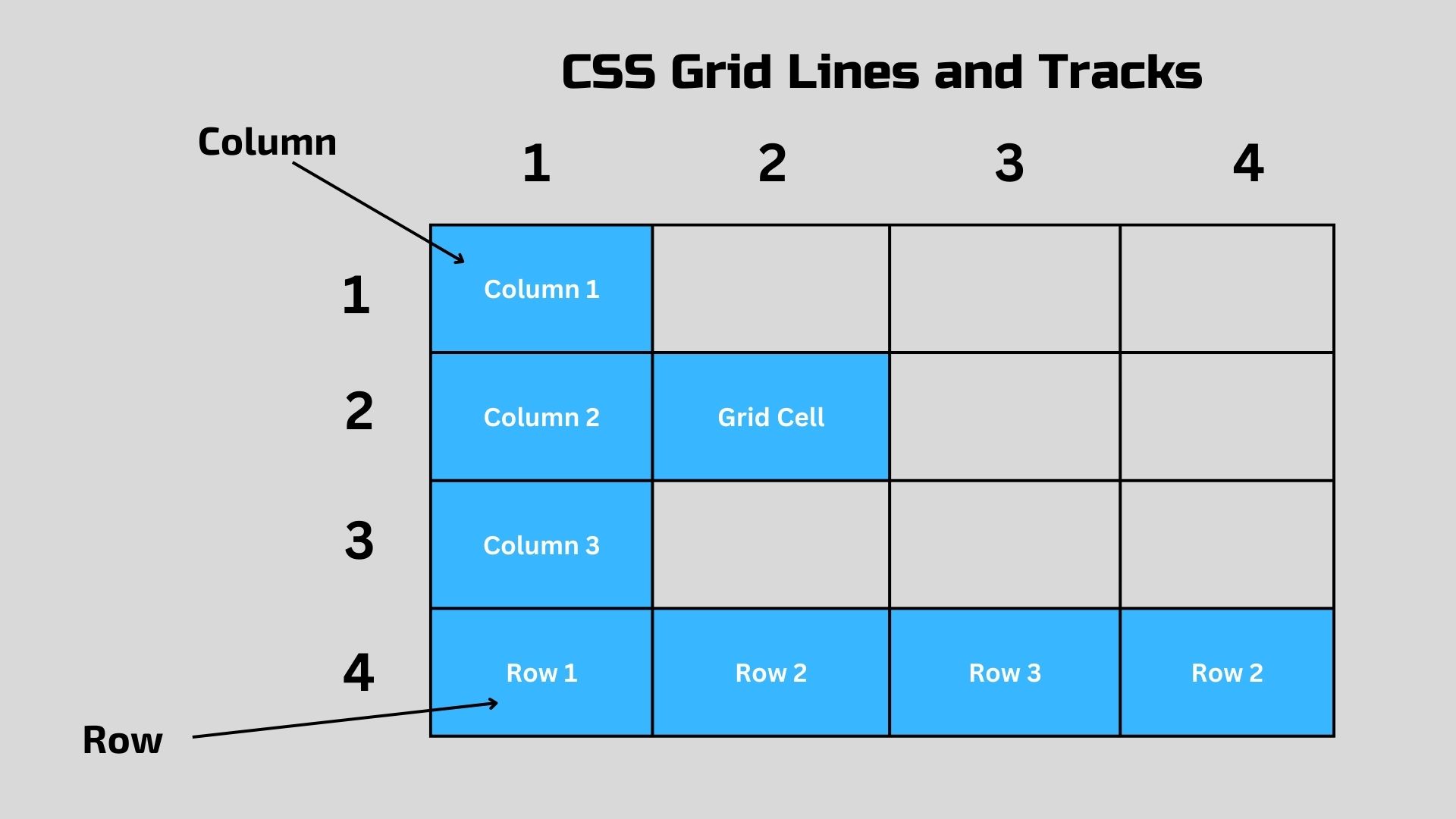
Basic Concepts of CSS Grid
To use CSS Grid effectively, you need to grasp its foundational elements:
- Grid Container: The parent element where you apply
display: grid. Its direct children become grid items.- Example:
.container { display: grid; }
- Example:
- Grid Lines: Invisible lines that divide the grid into rows and columns, numbered starting at 1.
- Grid Tracks: The spaces between grid lines, forming rows or columns.
- Grid Cells: The smallest unit in a grid, created where a row and column intersect.
- Grid Areas: Larger sections spanning multiple cells, useful for grouping content.
Understanding these terms sets the stage for building your grid.
Defining a Grid Structure
Creating a grid starts with the container and its structure:
- grid-template-columns and grid-template-rows: Define the number and size of columns and rows.
- Units: Pixels (
200px), percentages (25%), orfr(fraction of available space). - Example:
grid-template-columns: 200px 1fr;(one 200px column, one flexible column).
- Units: Pixels (
- repeat(): Simplifies defining multiple tracks.
- Example:
grid-template-columns: repeat(3, 1fr);(three equal-width columns).
- Example:
- auto-fit and auto-fill: Make grids responsive.
grid-template-columns: repeat(auto-fit, minmax(200px, 1fr));adjusts columns to fit, ensuring each is at least 200px wide.
Example Code:
.grid {
  display: grid;
  grid-template-columns: 200px 1fr;
  grid-template-rows: 100px auto;
}
This creates a grid with two columns (fixed and flexible) and two rows (fixed and auto-sized).
Placing Items on the Grid
Position grid items with precision:
- grid-column-start and grid-column-end: Set the start and end column lines.
- Shorthand:
grid-column: 1 / 3;(spans from line 1 to 3).
- Shorthand:
- grid-row-start and grid-row-end: Same for rows.
- Shorthand:
grid-row: 1 / 2;.
- Shorthand:
- span: Specify how many tracks an item covers.
- Example:
grid-column: 1 / span 2;(spans two columns).
- Example:
- grid-template-areas: Name areas for easier placement.
.grid {
  grid-template-areas: "header header" "nav main";
}
.header { grid-area: header; }
Grid Alignment and Spacing
Control how your grid and items align:
- justify-content: Horizontal alignment of the grid (e.g.,
center,space-between). - align-content: Vertical alignment of the grid.
- justify-items and align-items: Align all items within their cells.
- justify-self and align-self: Align individual items.
- grid-gap: Adds space between tracks.
- Shorthand:
grid-gap: 10px;(10px between rows and columns).
- Shorthand:
Example:
.grid {
  display: grid;
  grid-template-columns: repeat(3, 1fr);
  grid-gap: 15px;
  justify-content: center;
}
.item { align-self: center; }
Practical Examples
Let’s apply what we’ve learned with hands-on examples:
Simple Two-Column Layout
HTML:
<div class="grid">
  <nav>Navigation</nav>
  <main>Main Content</main>
</div>
CSS:
.grid {
  display: grid;
  grid-template-columns: 250px 1fr;
}Result:
Responsive Image Gallery
- CSS:
.gallery {
  display: grid;
  grid-template-columns: repeat(auto-fit, minmax(200px, 1fr));
  grid-gap: 10px;
}
.gallery img {
  width: 100%;
  height: auto;
}
Dashboard Layout
HTML:
<!DOCTYPE html>
<html lang="en">
<head>
  <meta charset="UTF-8">
  <meta name="viewport" content="width=device-width, initial-scale=1.0">
  <title>Dashboard Layout with CSS Grid</title>
  <style>
    /* Reset default margins and set font */
    body {
      margin: 0;
      font-family: Arial, sans-serif;
    }

    /* Grid container for the dashboard */
    .dashboard {
      display: grid;
      grid-template-areas:
        "header header header"
        "sidebar main main"
        "footer footer footer";
      grid-template-columns: 1fr 2fr 1fr; /* Sidebar: 1fr, Main: 2fr, Extra: 1fr */
      grid-template-rows: auto 1fr auto; /* Header: auto, Main: 1fr, Footer: auto */
      grid-gap: 10px; /* Spacing between grid items */
      height: 100vh; /* Full viewport height */
    }

    /* Header styling */
    .header {
      grid-area: header;
      background: #333;
      color: white;
      padding: 20px;
      text-align: center;
    }

    /* Sidebar styling */
    .sidebar {
      grid-area: sidebar;
      background: #f4f4f4;
      padding: 20px;
    }

    .sidebar ul {
      list-style: none;
      padding: 0;
    }

    .sidebar a {
      text-decoration: none;
      color: #333;
      display: block;
      padding: 10px 0;
    }

    .sidebar a:hover {
      color: #007bff;
    }

    /* Main content styling */
    .main {
      grid-area: main;
      background: #fff;
      padding: 20px;
    }

    /* Footer styling */
    .footer {
      grid-area: footer;
      background: #333;
      color: white;
      padding: 20px;
      text-align: center;
    }

    /* Responsive design for smaller screens */
    @media (max-width: 768px) {
      .dashboard {
        grid-template-areas:
          "header"
          "sidebar"
          "main"
          "footer";
        grid-template-columns: 1fr; /* Stack into one column */
        grid-template-rows: auto auto 1fr auto; /* Adjust row heights */
      }
    }
  </style>
</head>
<body>
  <div class="dashboard">
    <header class="header">
      <h1>Dashboard</h1>
    </header>
    <nav class="sidebar">
      <ul>
        <li><a href="#">Home</a></li>
        <li><a href="#">Profile</a></li>
        <li><a href="#">Settings</a></li>
      </ul>
    </nav>
    <main class="main">
      <h2>Welcome to Your Dashboard</h2>
      <p>This is where your main content goes. Add widgets, charts, or anything you need!</p>
    </main>
    <footer class="footer">
      <p>© 2025 Dashboard Example</p>
    </footer>
  </div>
</body>
</html>Result: A structured dashboard layout.
Dashboard
Welcome to Your Dashboard
This is where your main content goes. Add widgets, charts, or anything you need!
Frequently Asked Questions (FAQs)
1. What’s the difference between CSS Grid and Flexbox?
Flexbox: One-dimensional (rows or columns), ideal for linear layouts.
CSS Grid: Two-dimensional, perfect for complex grid-based designs.
2. How do I make my grid responsive?
Use auto-fit or auto-fill with minmax(), and adjust with media queries:
@media (max-width: 600px) {
.grid { grid-template-columns: 1fr; }
}
3. Can CSS Grid and Flexbox be combined?
Yes! Use Grid for the overall layout and Flexbox for item alignment within cells.
For more, check out our Introduction to Flexbox tutorial or MDN’s CSS Grid Guide.
Conclusion: Build Better Layouts with CSS Grid
Congratulations—you’ve just unlocked the power of CSS Grid! From defining rows and columns to crafting responsive galleries and dashboards, this tutorial has armed you with the tools to create modern, flexible web layouts. CSS Grid’s versatility, paired with its robust features like alignment and gaps, makes it indispensable for today’s web. Don’t stop here—experiment with your own projects, tweak the code, and explore resources like CSS-Tricks’ Complete Guide to Grid or our Responsive Web Design tutorial. Start building, and watch your designs come to life with CSS Grid!