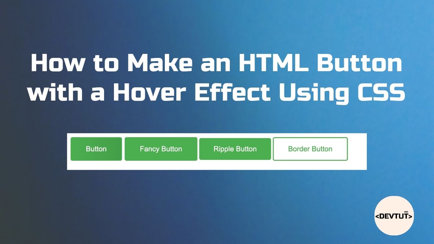
Creating interactive buttons is a foundational skill in web development. One of the most effective ways to enhance user experience is by implementing hover effects, which provide visual feedback when users interact with your buttons. In this comprehensive guide, we’ll explore How to Make an HTML Button with a Hover Effect Using CSS
Table of Contents
Understanding the Basics of HTML Buttons and CSS Hover Effects
Before diving into specific techniques, let’s understand what HTML buttons are and how CSS hover effects work with them.
Complete Output of Examples
HTML buttons are interactive elements that allow users to trigger actions on a webpage. They’re created using the <button> element or sometimes with <a> tags styled as buttons. When a user positions their cursor over these elements, we can trigger visual changes using CSS’s :hover pseudo-class.
The :hover pseudo-class allows us to define styles that only apply when a user hovers their cursor over an element. This creates an interactive experience that helps users understand that the element is clickable.
Creating a Basic HTML Button

Let’s start with a simple HTML button:
<button class="btn">Click Me</button>
This creates a standard button with the browser’s default styling. To customize it, we’ll need to add CSS.
Styling the Button with CSS
First, let’s style our button with some basic CSS:
.btn {
  background-color: #4CAF50;
  color: white;
  padding: 15px 32px;
  text-align: center;
  text-decoration: none;
  display: inline-block;
  font-size: 16px;
  margin: 4px 2px;
  cursor: pointer;
  border: none;
  border-radius: 4px;
  transition: all 0.3s ease;
}
This CSS gives our button a green background, white text, padding, and rounded corners. The transition property is particularly important as it ensures that any changes that occur during the hover effect happen smoothly over 0.3 seconds.
Adding a Basic Hover Effect
Now, let’s add a simple hover effect that changes the button’s background color when users hover over it:
.btn:hover {
  background-color: #45a049;
}
When a user hovers their cursor over the button, the background color will smoothly transition from #4CAF50 to a slightly darker shade, #45a049.
Creating More Advanced Hover Effects
Let’s explore some more engaging hover effects that can make your buttons stand out.
1. Scale Effect
A popular hover effect is to slightly increase the button’s size when hovered over:
.btn:hover {
  background-color: #45a049;
  transform: scale(1.05);
}
This will make the button appear to grow slightly when hovered over, creating a “pop” effect.
2. Shadow Effect
Adding a shadow can give your button a lifted appearance:
.btn:hover {
  background-color: #45a049;
  box-shadow: 0 5px 15px rgba(0, 0, 0, 0.3);
}
This creates the illusion that the button is lifting off the page when hovered over.
3. Color Inversion Effect
You can create a visually striking effect by inverting the button’s colors:
.btn {
  background-color: #4CAF50;
  color: white;
  /* Other styles */
  border: 2px solid #4CAF50;
}

.btn:hover {
  background-color: white;
  color: #4CAF50;
}
This effect swaps the background and text colors when the button is hovered over.
4. Gradient Shift Effect
For a more dynamic look, you can use gradients and shift them on hover:
.btn {
  background-image: linear-gradient(to right, #4CAF50, #45a049);
  /* Other styles */
}

.btn:hover {
  background-image: linear-gradient(to right, #45a049, #4CAF50);
}
This creates a subtle shift in the gradient direction when hovered over.
Creating a Complete Button with Multiple Effects
Let’s combine several effects to create a button with a sophisticated hover interaction:
<button class="fancy-btn">Click Me</button>
.fancy-btn {
  background-color: #4CAF50;
  color: white;
  padding: 15px 32px;
  text-align: center;
  font-size: 16px;
  border: 2px solid #4CAF50;
  border-radius: 4px;
  cursor: pointer;
  position: relative;
  overflow: hidden;
  transition: all 0.3s ease;
}

.fancy-btn:hover {
  background-color: white;
  color: #4CAF50;
  transform: translateY(-3px);
  box-shadow: 0 10px 20px rgba(0, 0, 0, 0.2);
}

.fancy-btn:active {
  transform: translateY(-1px);
  box-shadow: 0 5px 10px rgba(0, 0, 0, 0.2);
}
This button combines color inversion, a slight upward movement, and a shadow effect when hovered over. We’ve also added an :active state to create a responsive feel when the button is clicked.
Adding Animated Effects
For even more engaging buttons, we can add animations that trigger on hover:
1. Ripple Effect
<button class="ripple-btn">Click Me</button>
.ripple-btn {
  background-color: #4CAF50;
  color: white;
  padding: 15px 32px;
  text-align: center;
  font-size: 16px;
  border: none;
  border-radius: 4px;
  cursor: pointer;
  position: relative;
  overflow: hidden;
  transition: all 0.3s ease;
}

.ripple-btn:before {
  content: "";
  position: absolute;
  top: 50%;
  left: 50%;
  width: 0;
  height: 0;
  background: rgba(255, 255, 255, 0.5);
  border-radius: 50%;
  transform: translate(-50%, -50%);
  transition: all 0.6s ease;
}

.ripple-btn:hover:before {
  width: 200%;
  height: 200%;
}

.ripple-btn:hover {
  color: #4CAF50;
}
This creates a ripple effect that expands from the center of the button when hovered over.
2. Border Animation
<button class="border-btn">Click Me</button>
.border-btn {
  background-color: transparent;
  color: #4CAF50;
  padding: 15px 32px;
  text-align: center;
  font-size: 16px;
  border: 2px solid #4CAF50;
  border-radius: 4px;
  cursor: pointer;
  position: relative;
  transition: all 0.3s ease;
}

.border-btn:hover {
  background-color: #4CAF50;
  color: white;
}

.border-btn:before {
  content: "";
  position: absolute;
  top: 0;
  left: 0;
  width: 0;
  height: 100%;
  background-color: rgba(255, 255, 255, 0.2);
  transition: all 0.3s ease;
}

.border-btn:hover:before {
  width: 100%;
}
This creates a sweeping animation from left to right when the button is hovered over.
Best Practices for Button Hover Effects
When implementing hover effects, keep these best practices in mind:
- Subtle is Better: Small, subtle effects often create a more professional look than dramatic ones.
- Keep Transitions Smooth: Always use the
transitionproperty to ensure smooth animations. - Consider Accessibility: Ensure your hover effects don’t negatively impact accessibility. Buttons should be usable for people who navigate with keyboards or screen readers.
- Test on Different Devices: Remember that hover effects won’t work on touch devices. Ensure your buttons are still usable and attractive on mobile.
- Maintain Consistency: Use similar hover effects across your site for a cohesive user experience.
Browser Compatibility
Most modern browsers support the CSS properties we’ve discussed. However, for older browsers, you might need to use vendor prefixes like -webkit-, -moz-, or -ms- for certain properties.
Conclusion
Creating HTML buttons with hover effects using CSS is a powerful way to enhance user experience on your website. From simple color changes to complex animations, these effects can make your buttons more engaging and intuitive. Remember to keep your designs subtle, consistent, and accessible to create the best possible user experience.
By experimenting with different combinations of effects, you can create unique buttons that match your website’s style while providing clear visual feedback to users.
Frequently Asked Questions
How do I make my button hover effects work on mobile devices?
Hover effects don’t work on touchscreens since there’s no cursor to hover. Instead, consider using :active or :focus states to create similar effects when buttons are tapped on mobile devices. You can also use media queries to provide alternative styles for touch devices.
Can I add multiple hover effects to the same button?
Yes, you can combine multiple effects like color changes, scaling, and shadows in the same :hover selector. Just be careful not to overdo it, as too many effects can appear unprofessional.
How do I create a button that changes its text on hover?
You can use the data-text attribute and the :before or :after pseudo-element to change text on hover. Here’s an example:
<button class="text-change-btn" data-text="Hover Me!">Click Me!</button>
.text-change-btn:hover {
  color: transparent;
}

.text-change-btn:hover:after {
  content: attr(data-text);
  position: absolute;
  top: 0;
  left: 0;
  display: flex;
  align-items: center;
  justify-content: center;
  width: 100%;
  height: 100%;
  color: #4CAF50;
}
How can I ensure my hover effects are accessible?
Ensure your buttons have sufficient color contrast, are keyboard navigable, and include appropriate ARIA attributes when necessary. Don’t rely solely on color changes for hover effects; include shape or size changes as well for users with color vision deficiencies.